THE CHALLENGE
To build a visually minimalistic yet technically sophisticated site that:
- Reflects the agency’s international reach
- Speaks the language of the IT community
- Feels clean and focused, without being sterile
- Effectively targets both companies and candidates
- Balances a strict black-and-white aesthetic with a strong, memorable identity
THE SOLUTION
We crafted a site that doesn’t shout — it speaks with quiet confidence, enhanced by thoughtful interactive details designed to make a lasting impression:
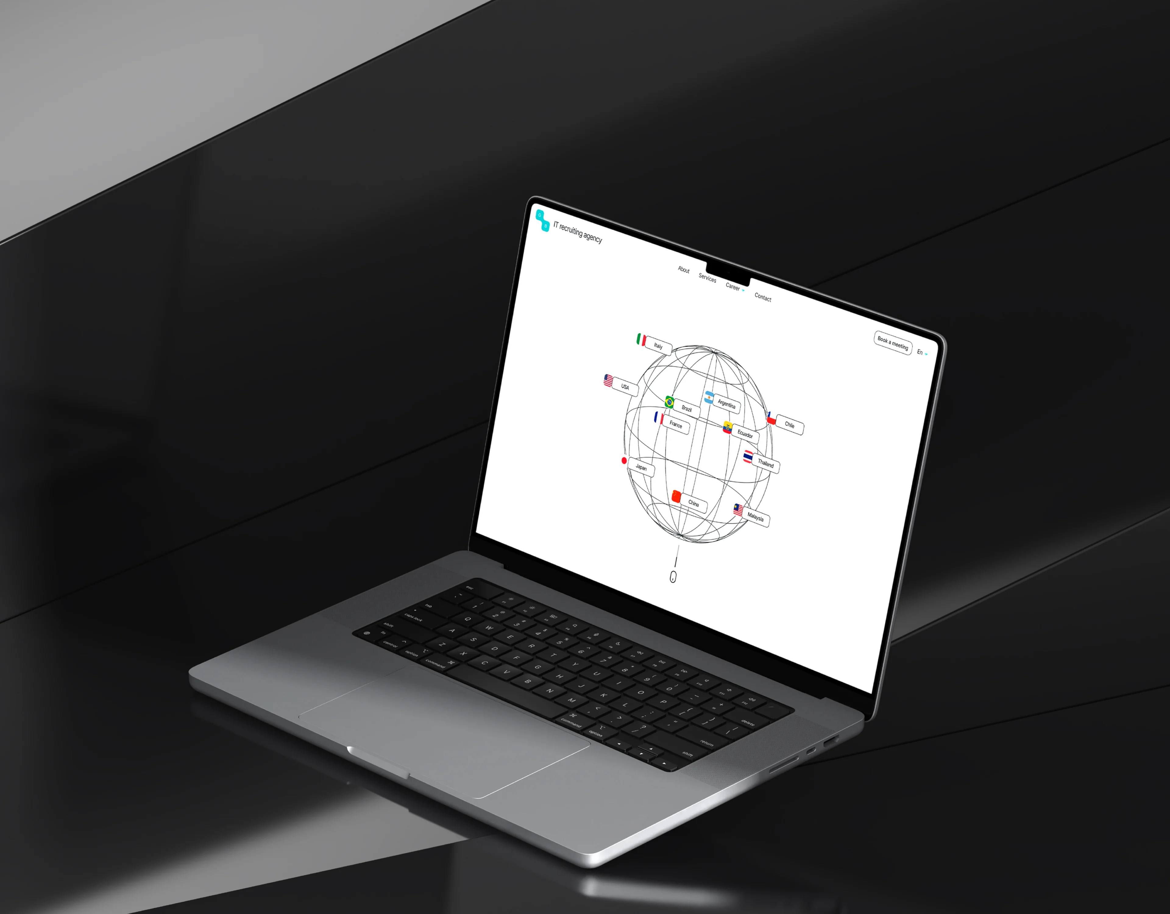
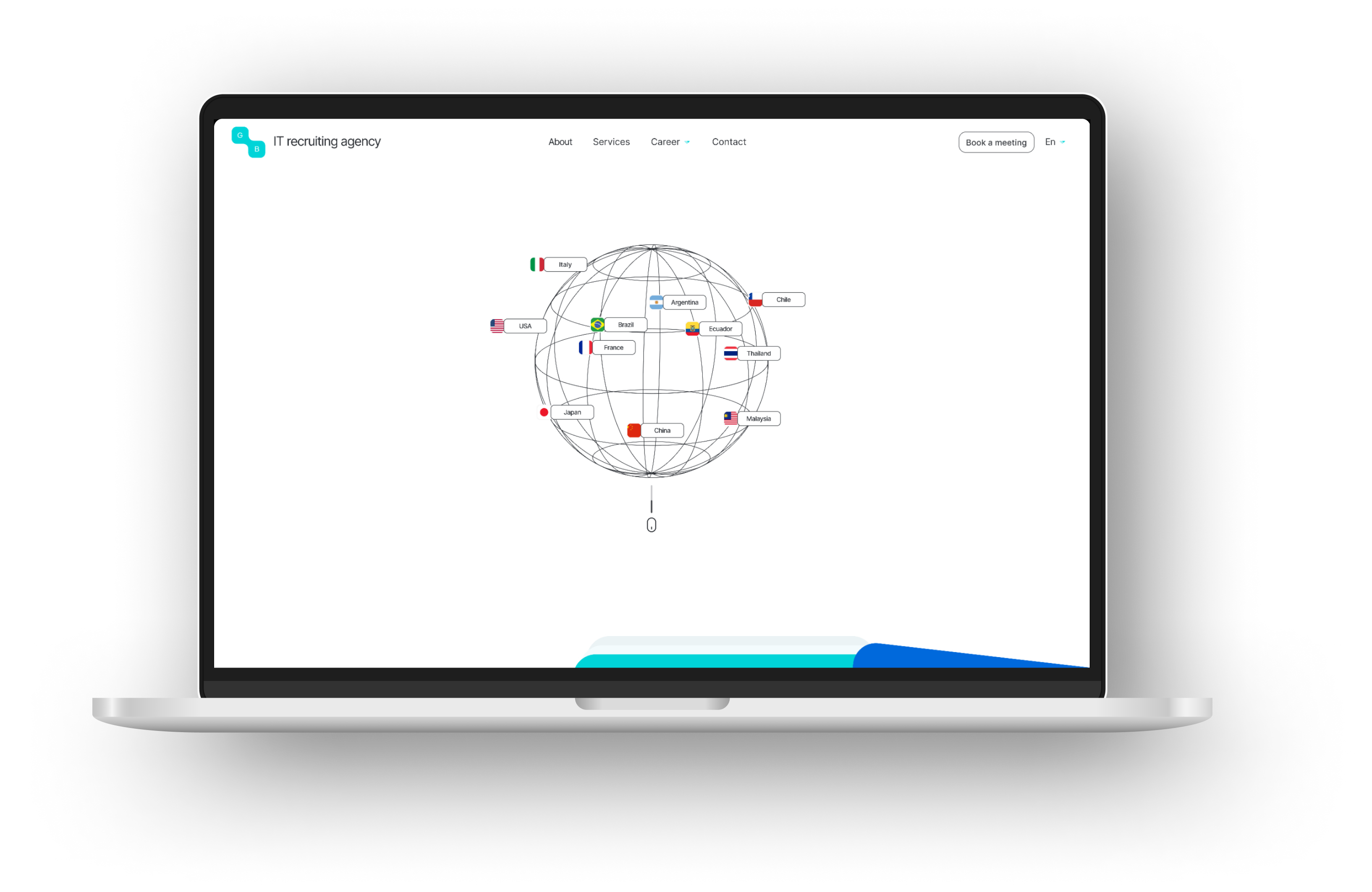
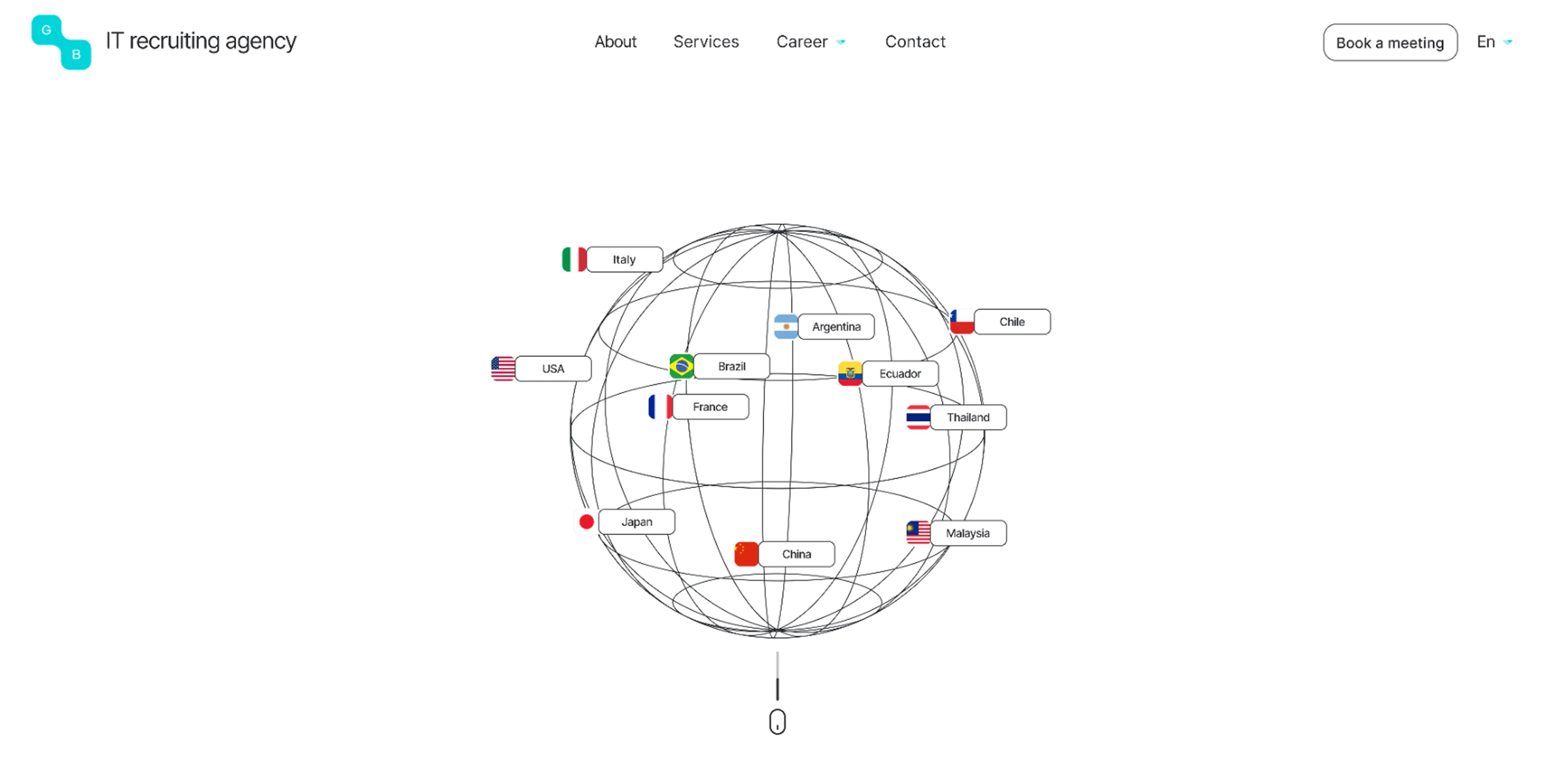
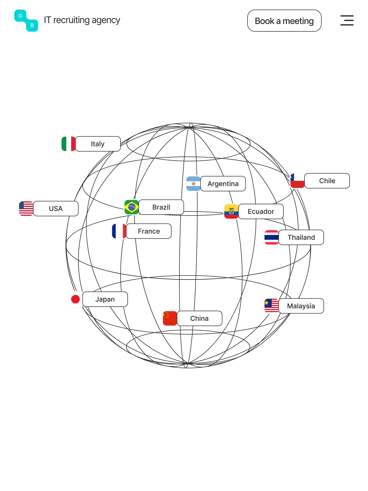
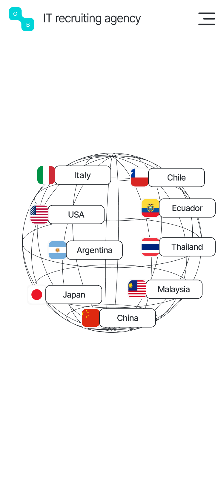
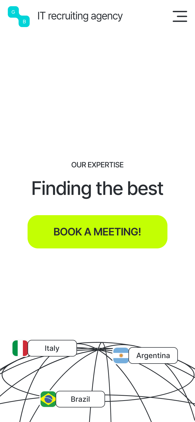
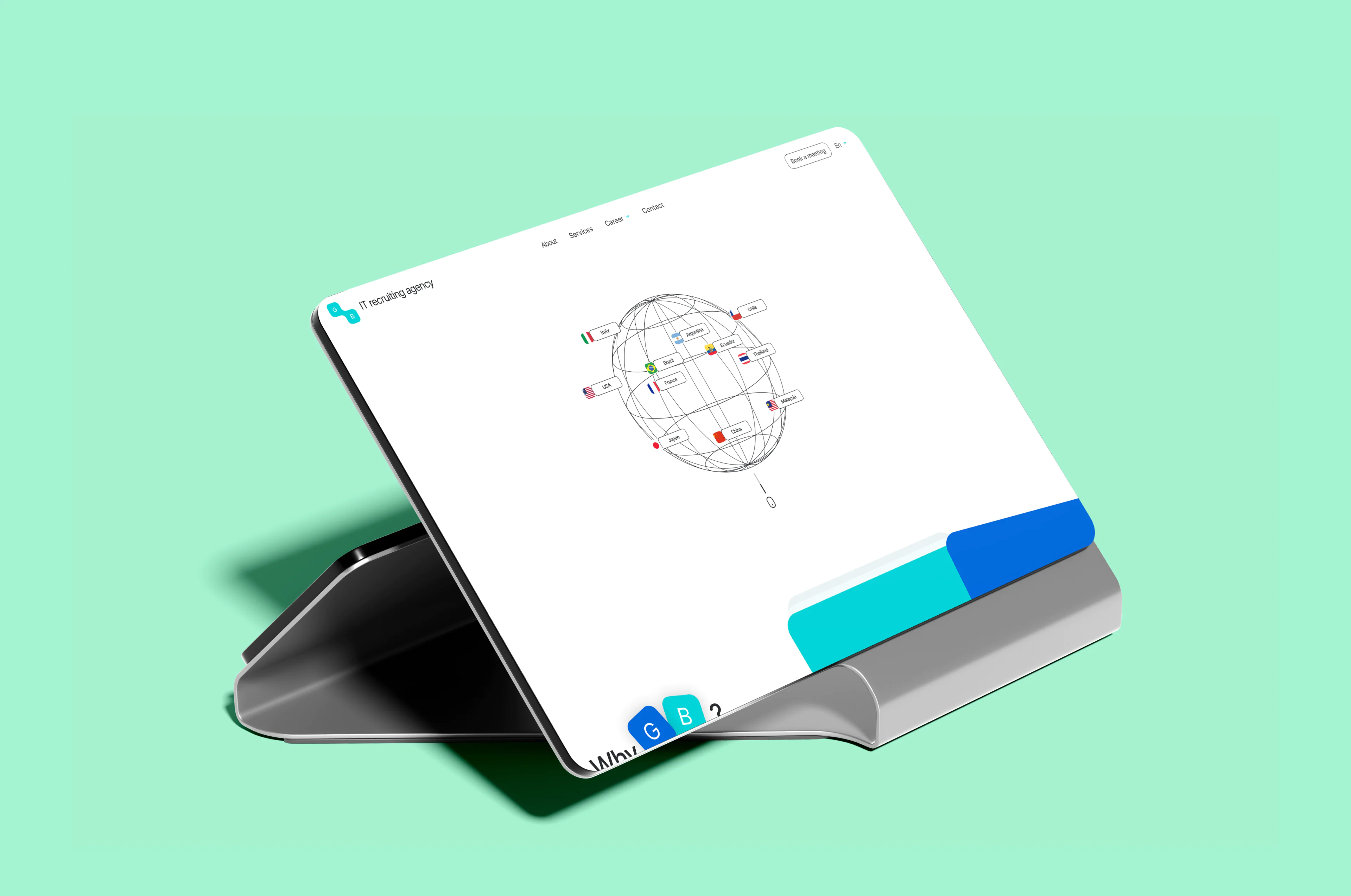
- 3D Interactive Globe. A spinning, interactive planet on the homepage visually communicates the agency’s global footprint — not a generic map, but an interactive rotating model.
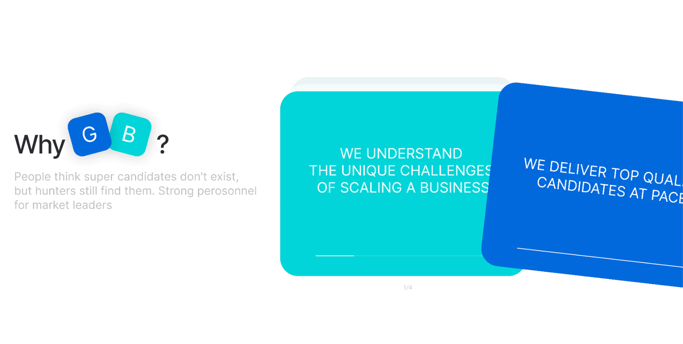
- Custom Card Slider with UX-inspired timer. Inspired by familiar loading animations in developer tools, this subtle UI touch mimics an auto-scanning system — as if the system itself scans eligible candidates.
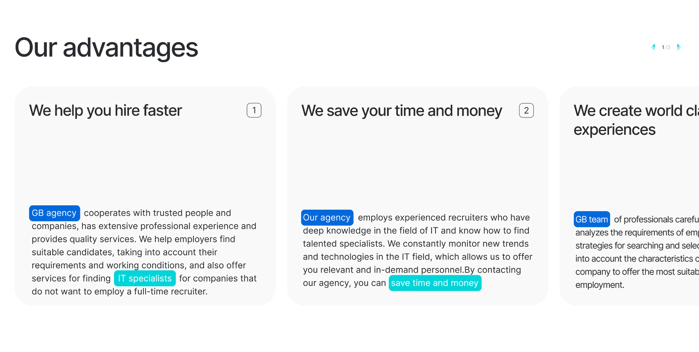
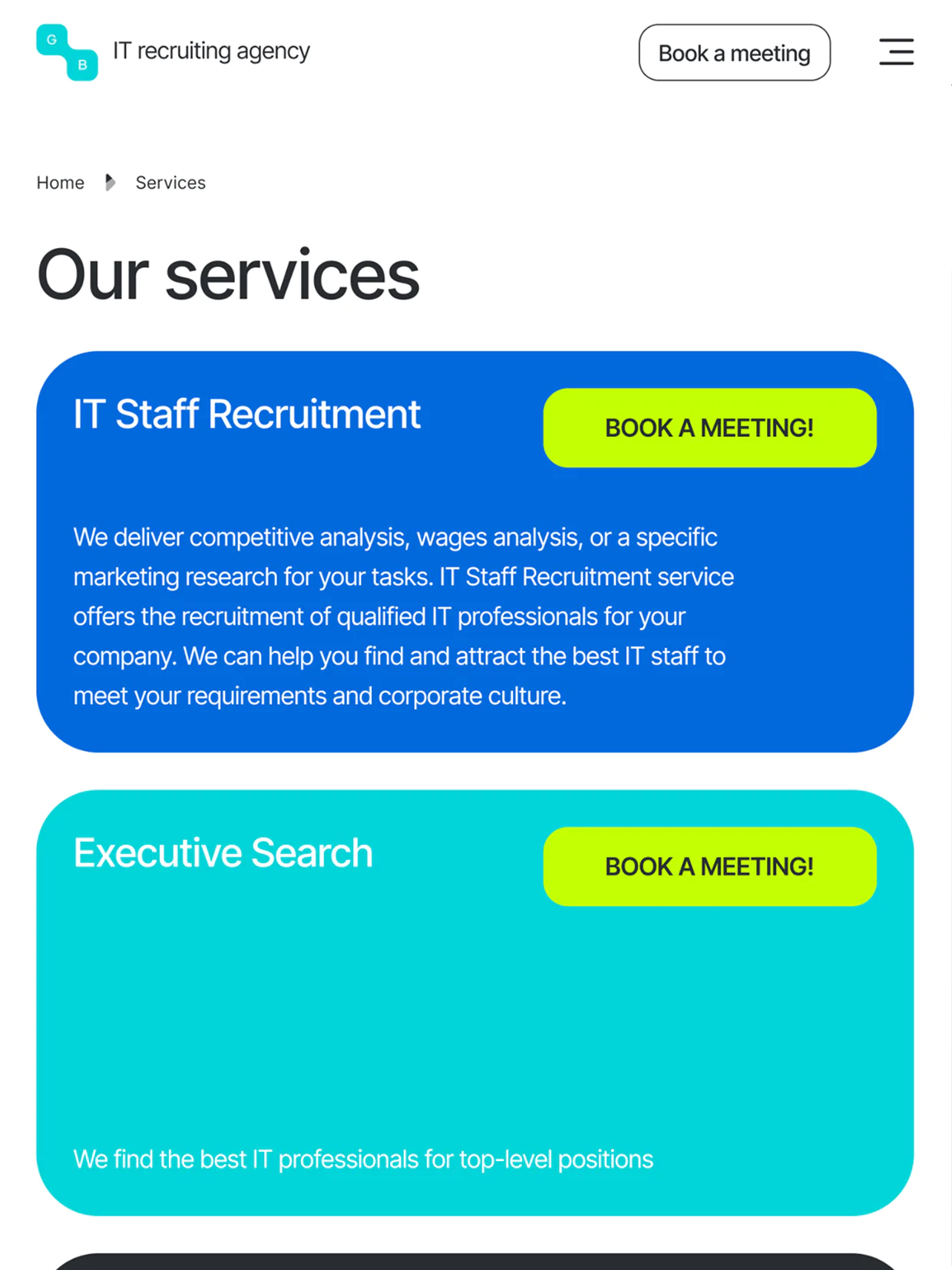
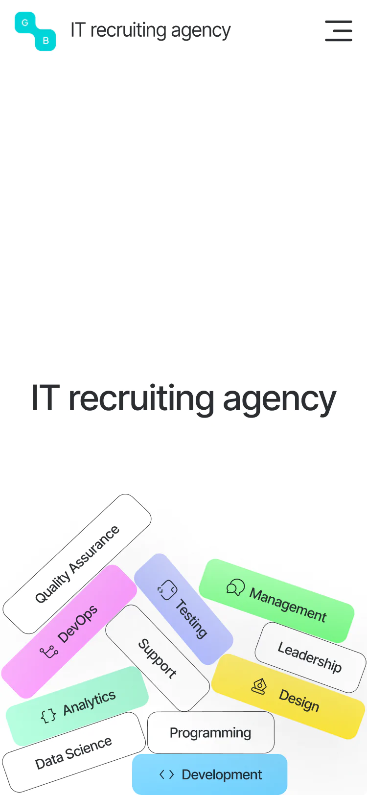
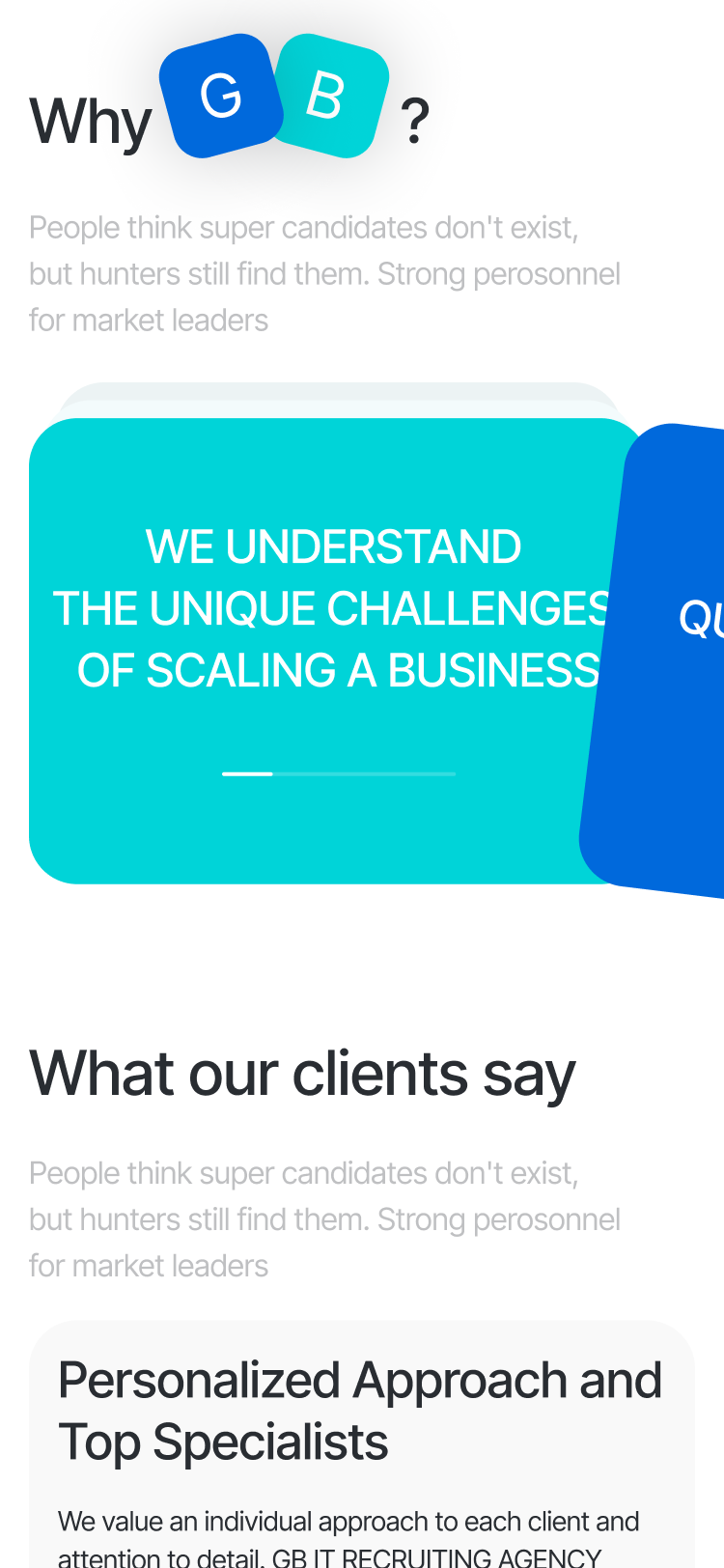
- Minimalist with Meaningful Accents. While the client envisioned a strictly black-and-white look, we introduced a refined palette of 10 highlight colors — drawn from the way developers and designers mark up notes and code. These carefully selected hues add clarity and emphasis without breaking the minimalist aesthetic.
Brand Identity & Logo System. We didn’t just create a logo — we developed a scalable brand system. From usage guidelines to social media visuals, the new identity anchors the company’s image for years to come.
Tablet Version
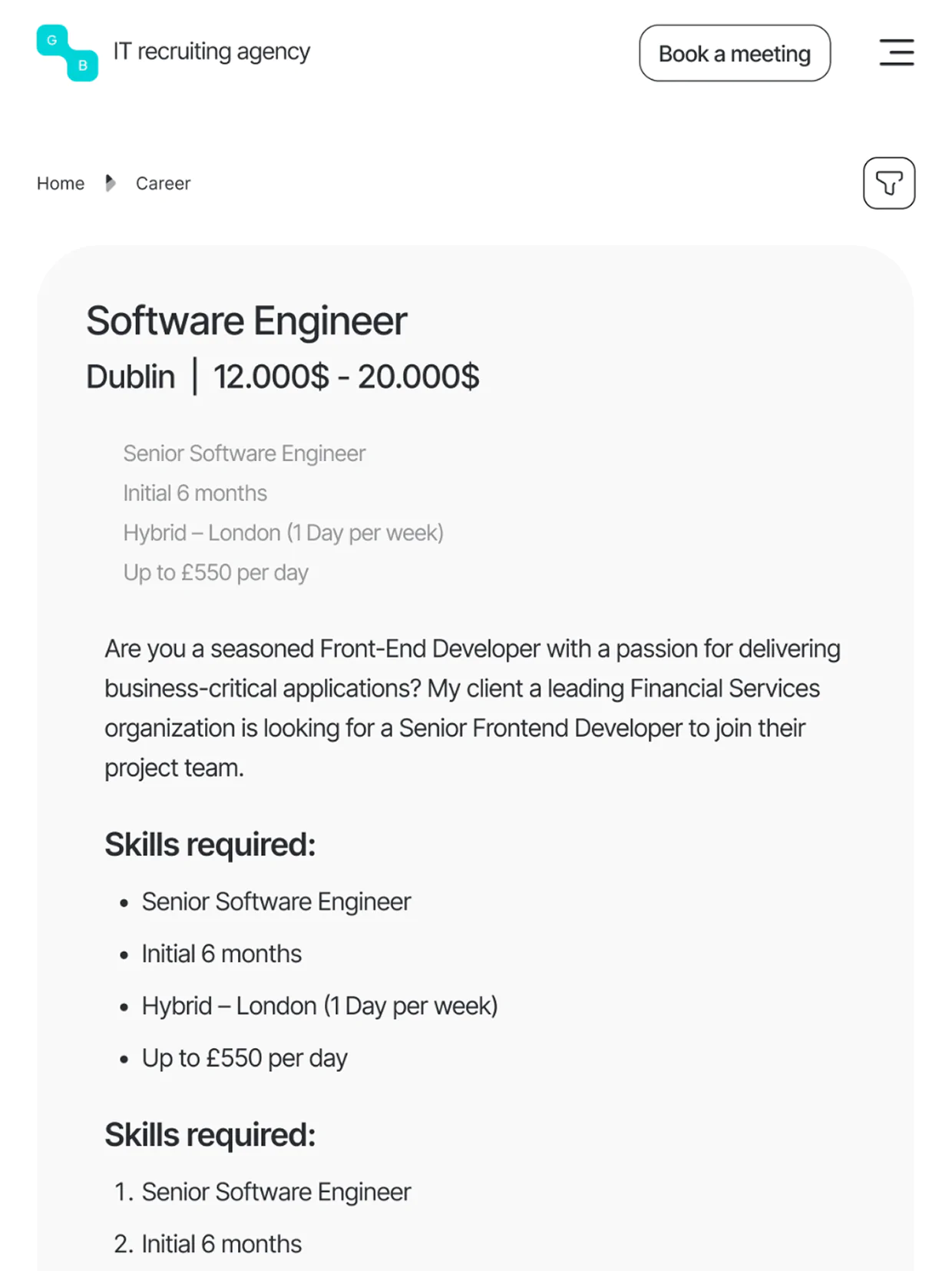
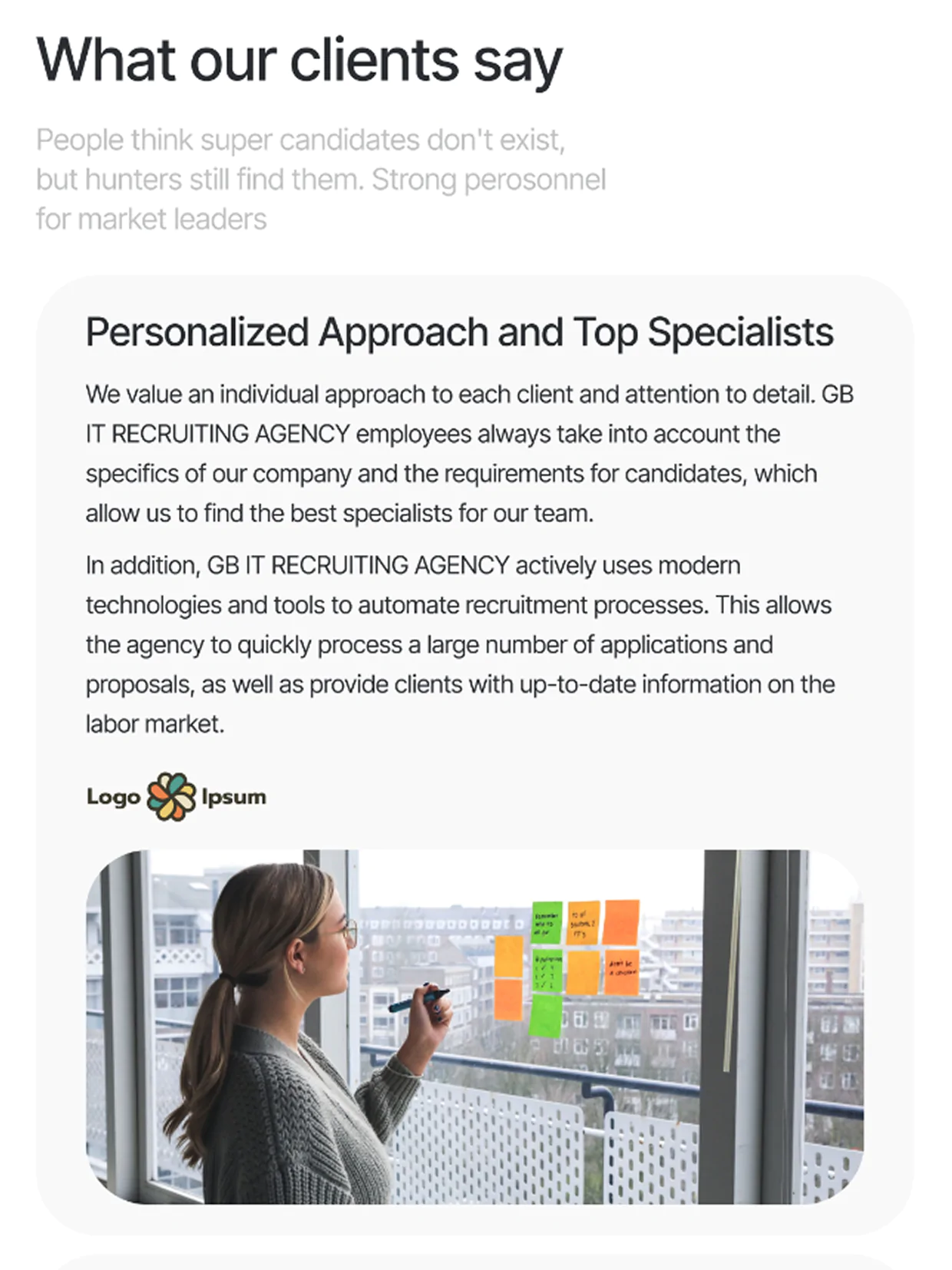
Mobile Version
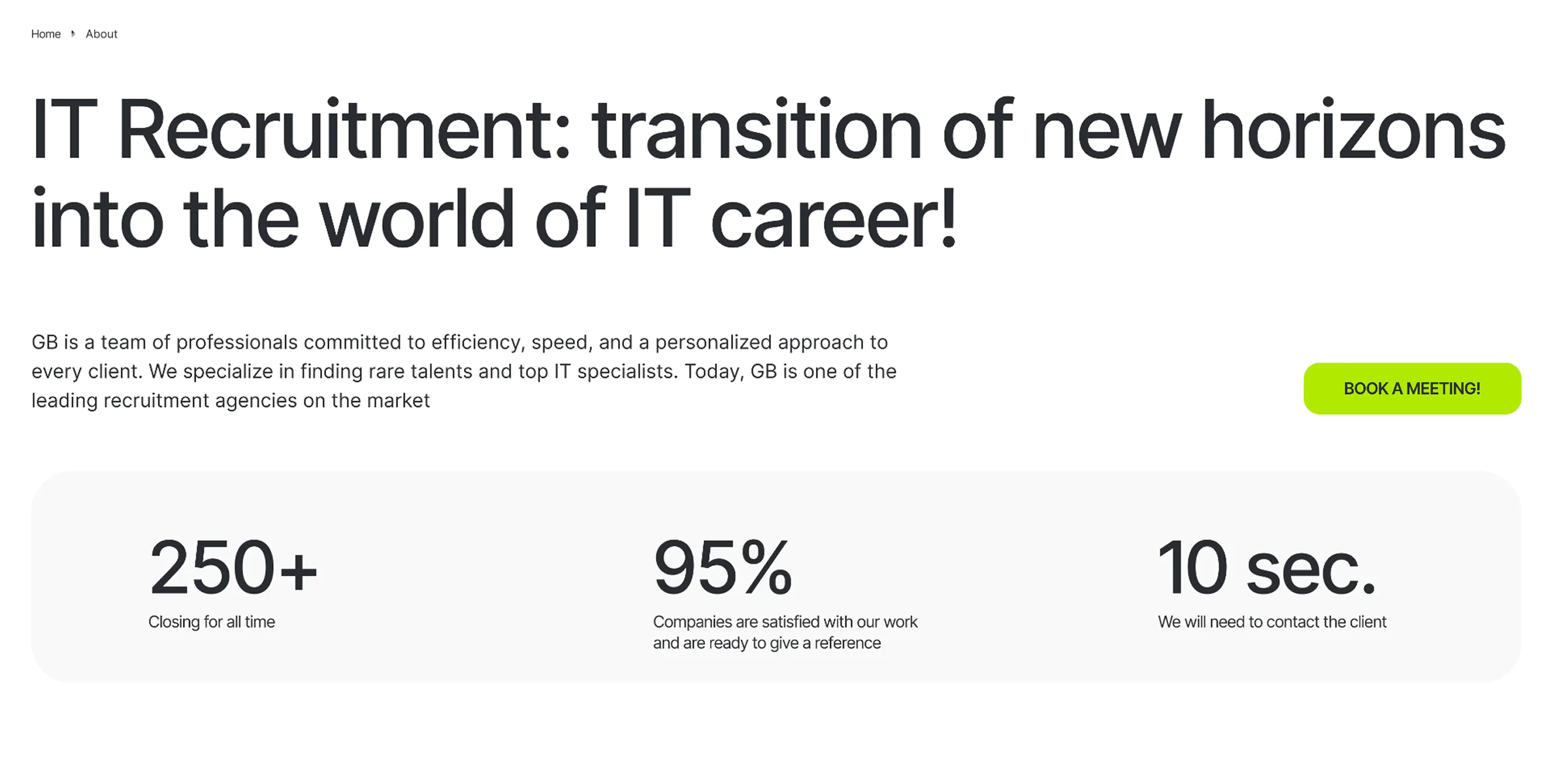
Result
This isn’t just another agency website. We helped the agency make a bold statement: “We find the talent you’ll need tomorrow — today.”
Let’s Discuss Your Project

Tell us what you need, and we’ll help make it happen.